The 8 Pitfalls of Current Wallet UX
Introduction
Few blockchain applications provide great user experiences. On average, conventional apps tend to have much better designs and UX. After researching common UX pitfalls in blockchain apps and looking for inspiration for wallet UI, we realized how few design resources were available for blockchain projects.
There is a wide variety of UX and UI resources (like designnotes.co) that inspire and teach about general UX problems. However, nothing similar is available for design within the blockchain space.
As part of Ape Unit’s CO3 project, we went through around 30 blockchain projects — learning about the good and the bad of current wallet UX.
Research
Our UX research focused on four basic functionalities of wallets: balance, transaction history, sending and receiving money, and backing up wallets. We tested these functionalities within 30 different wallets and documented it by screenshotting these wallets’ interfaces. Using these screenshots, we analyzed the UX of the wallets and to justify our findings.
We created user stories based on the user flow found in those apps. Our baseline persona was an average person who is comfortable with a smartphone and uses it every day. However, they’re not interested in the technologies that lay behind the apps they use. We made versions of this persona to fit different age groups and shaped user stories accordingly. Using their user-stories, we extracted the pain points we imagined these personas would have while using wallets.
The 8 main pain points are:
- User Addresses that are too Complex
- Lack of Account Backup and Recovery Process
- Non-Educational Onboarding Process
- Slow Process of Converting Fiat Money into Cryptocurrencies
- Unpredictable Transaction Fees
- Lack of Feedback
- Overwhelming Number of Currencies and DeFi-Features
- Use of Jargon
While the issues of complicated user addresses and backup/recovery processes stem from current technological limitations, most of these problems are implementation issues resulting from either a lack of awareness of users’ needs or an unwillingness to accommodate non-expert users.
Pain Points
1. Complex User Addresses
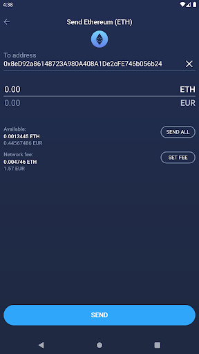
Addresses are one of the centerpieces of anything blockchain-related, and they typically look like this: 0x8eD92a86148723A980A408A1De2cFE746b056b24. An address is a user’s unique identifier, to which other users can send cryptocurrencies. Just by looking at the address above, anyone can see that it’s not the most useful for everyday payments.
One of the main weaknesses of wallet addresses is that they have no pattern. Recognizing them outside of the crypto context is impossible. Meanwhile, addresses for other payment apps like Cash app are easily recognizable in any context.
- Since wallet addresses have no pattern, users can’t easily tell if they made an error while writing the address.
- Making an error with the address can happen easily, which is fatal for users. If you make an error with an IBAN, you can still call the bank to cancel the transfer. However, crypto transfers are final.
- Addresses are not memorizable.
- Addresses cannot be easily recited, for example, on the phone.
- Users have a different personal address for every currency in their wallet.
Domains were introduced on the ARPANET (the predecessor of the modern internet) in 1985, four years before WWW was released. The scientists working on the ARPANET realized that using IP-addresses to reach webpages limited scalability and user adoption. It’s a wonder why people haven’t recognized earlier how necessary human-readable addresses are for usability and scalability in crypto.
In 2019, the Ethereum Name Service (ENS) was released, which promised to end the use of unreadable addresses. ENS is the decentralized equivalent to classical domains. With ENS, you can register an address to a “.ens” domain for a small fee. So, I registered my address to “dgtlntv.eth,” and if your wallet supports it, you could now send Ethereum to me using this domain instead of 0x8eD92a86148723A980A408A1De2cFE746b056b24.
With some wallets, you can already input an ENS domain instead of an address. Argent is one of the only wallets that offers its users a free ENS domain during setup.
For this problem to be solved, ENS would need widespread adoption, and every user would somehow need an ENS domain for free!
*Fig.1,2 – Like most wallets in the Atomic Wallet and the Lumi wallet, users have to input the cryptic address either by copying/pasting it or scanning a QR Code.
Fig.3 – Some wallets, like Argent Wallet, support the use of ENS Domains. Argent is also one of the only wallets that actively provide their users with ENS domains during setup, so their users don’t register a domain themselves.
2. Account Backup and Recovery Process
Cryptocurrencies differ from traditional payment services. Your funds exist in a decentralized system, rather than being held by a company. With crypto, you have complete responsibility for your funds. If you lose your wallet, you can’t call someone to help you recover it — your wallet needs to be backed up for you to recover it yourself.
Backing up your wallet means (in most cases) that you have to write down a secret recovery phrase that is either 12 or 24 words long.
With recovery phrases, users have a high level of personal responsibility, which isn’t common in other popular apps. This responsibility and the backup process, therefore, provides a considerable inconvenience to the users.
Many apps circumvent this inconvenience by neither requiring users to back up their wallets nor educating them about its importance. In my opinion, this is poor practice because novice users won’t know the importance of backing up their wallets if they are not informed about it.
Many users will never back up their wallets, which will lead many of them to lose their funds at some point. Overall, it is a much worse experience than going through the inconvenience of backing up their wallets. It should be the developers’ responsibility to either force their users to or educate their users about the importance of backing up their wallets. Since many people can’t afford to lose their wallet, it’s poor UX design not to.
Like Argent (with social recovery methods) and ZenGo (with threshold signatures), some wallets take a different wallet recovery approach. However, in my opinion, there is still no recovery method that has exceptional UX.
3. Non-educational Onboarding Process
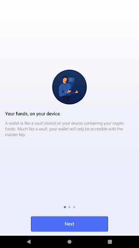
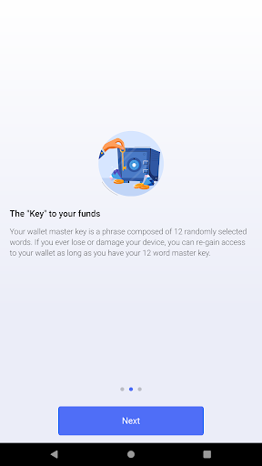
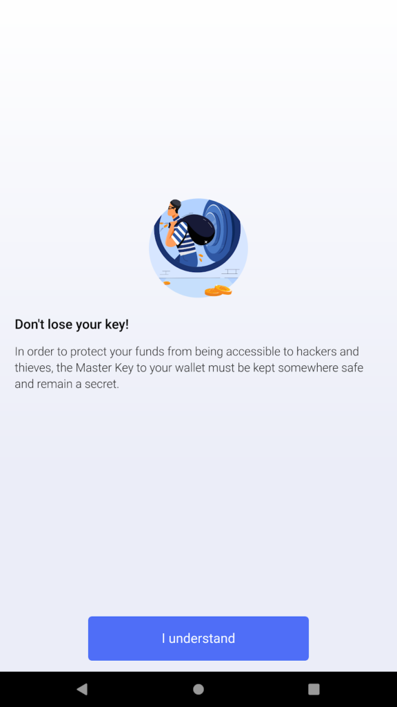
For most people, (Mobile)-Wallets are their first and primary interaction with blockchain technology. Making a good first impression and explaining basic concepts in the on-boarding process will be crucial for the wallet’s and the industry’s success. Because people only trust products and services that they understand, if the first steps aren’t straightforward, adoption will be slow. Today, many wallets either focus on advanced users and don’t explain anything, or appeal to a broader audience but fail to explain essential concepts well enough for novice users to feel supported.
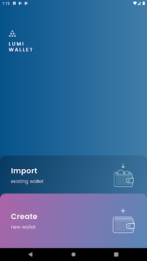
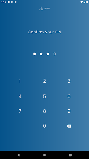
With the Lumi wallet, the onboarding is very short. You will have to set up a pin, but other than that, there is no backup process or educational content.
These screens from the Bitpay-Wallet are not part of their onboarding, but this is the type of educational content that should be part of the onboarding process.
4. Converting Fiat Money into Cryptocurrencies
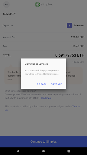
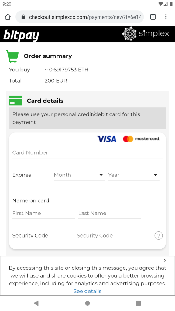
Many, if not most, wallets already include an On-Ramp service. An On-Ramp service converts your fiat money into cryptocurrencies. It is essential for most wallets since it significantly lowers the barrier of entry for novice users. Most wallets today already include an On-Ramp service. However, they often direct users to the website of a third-party service.
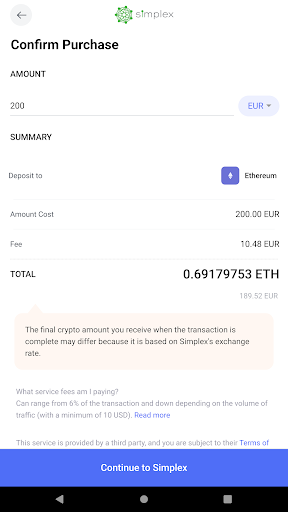
In my opinion, wallets should integrate the On-Ramp into their app rather than forwarding users to another site. Users might not trust third-party sites with their credit card details, and forwarding adds unnecessary complexity to the On-Ramp service.
Fig. 1, 2, 3 – These Screens show the On-Ramp Service of the BitPay-Wallet. At first, you can select the cryptocurrency and the amount you want to buy. After that, it forwards you to the website of simplex, their On-Ramp partner.
5. Overwhelming Number of Currencies and DeFi-Features
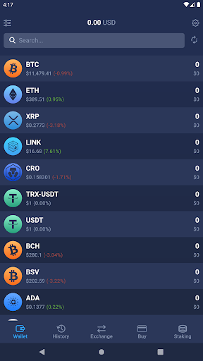
People are not used to handling multiple currencies in their everyday life. The option to obtain and use so many different currencies might overwhelm users. Furthermore, these currencies work differently from fiat currency from a technical perspective. One can’t expect laypersons to learn about all of them.
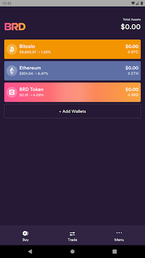
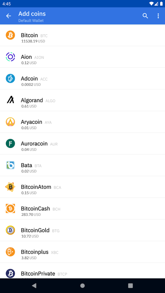
At first, a wallet should display only the most popular currencies (e.g., BTC and ETH). Suppose the user is advanced enough to know about other currencies. In that case, they could add these other currencies to their wallets as the need arises.
Fig. 1 – The Coinomi Wallet asks users to select which “coins” they want to “add” during the onboarding.
Fig.2 – The Atom Wallet displays all possible currencies by default.
Fig.3 – The BRD Wallet only displays Bitcoin, Ethereum, and BRD Token.
6. Transaction Fees
Fees work differently in crypto than in other payment services. Most people are familiar with two types of fee structures: yearly/monthly fees (like from their banks) and commercial transaction fees (like when paying someone on PayPal). With crypto, you have to pay a fee for every transaction that’s amount depends on the state of the network. Users will have to be educated about this difference to make them less skeptical about these changing fees.
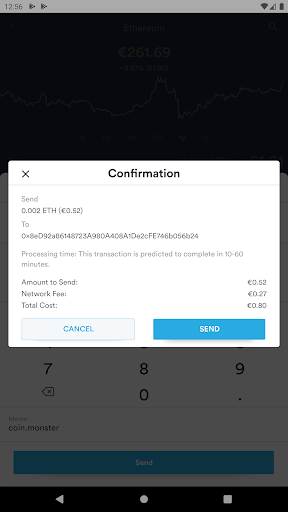
Fig. 1 – In the BRD Wallet, the Transaction Fee is displayed on the confirmation screen, with no context how this fee was calculated.
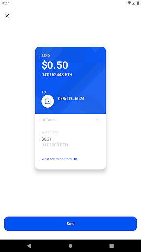
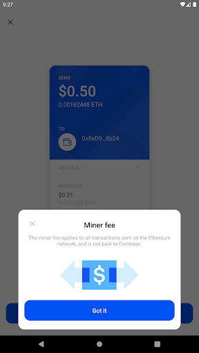
Fig. 2,3 – The only Wallet we know which provides a little bit of information about fees is the Coinbase wallet.
7. Missing Feedback
Providing users with proper feedback about the features that are different from conventional payment apps is extremely important. Users on social payment apps like PayPal or cash.app are used to having instant transactions. With crypto transactions, transfer time depends on the currency you are sending, the state of the network, and the amount of gas you buy (gas is the fee you pay for each transaction).
In some wallets, only fully verified transactions show up in the transaction history — sometimes this can take up to 30 minutes or longer. During this timeframe, new users might be worried that they did something wrong and lost their funds.
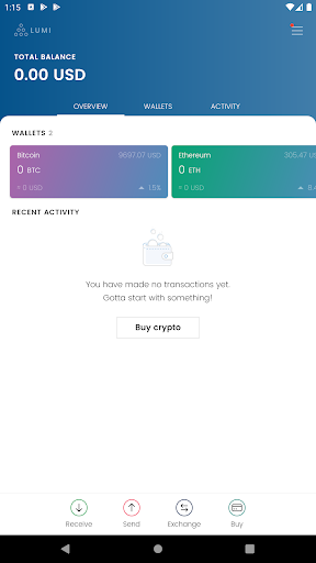
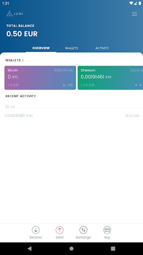
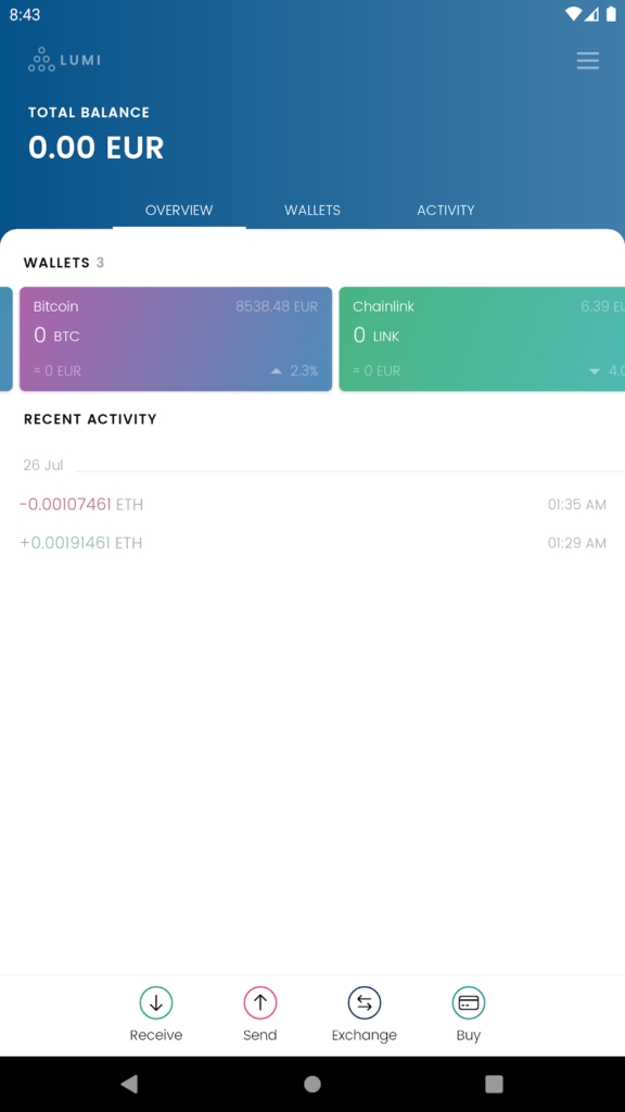
Fig. 1, 2 – The Lumi Wallet shows the outgoing transaction only after the transaction has been confirmed. This delay means that the account balance will appear lower for a short time even though the transaction doesn’t yet appear in the history.
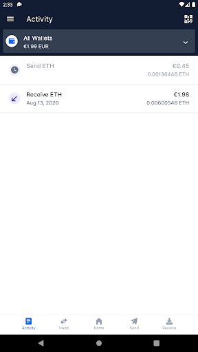
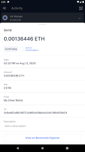
Fig. 1, 2, 3 – In the “Blockchain Wallet,” the outgoing transaction immediately appears in the transaction history. The grey clock icon signals a pending status. If you click on the transaction, it will direct you to a transaction overview. Here you can see that the transaction’s confirmation status and the number of remaining confirmations needed to finalize the transaction.
8. Jargon
Many wallets use industry-specific language in their descriptions and explanations. This practice is unnecessary and alienates users unfamiliar with this jargon.
Fig. 1,2 – When going into the Lumi Wallet settings, the Wallet-Backup is called “Backup Wallet.” However, when clicking on it, the Lumi Wallet prompts you to “Write down your mnemonic phrase.” Using the word “Mnemonic phrase” is unnecessary in this context.
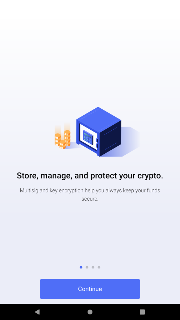
Fig. 3 – In Onboarding, BitPay promises additional security through “Multisig and key encryption.”
Conclusion
There is still a lot of work and research needed regarding the wallet UX and an enormous need for designers in this industry. Venturing into the blockchain industry as a designer isn’t easy since designers will have to pave the way for themselves. Even for designers already working in the blockchain field, there is no platform to discuss common design patterns for this decentralized industry.
At Ape Unit, we are working on a platform — called neueux — to fill this gap in the market. It’s still a work in progress, but we hope to share it with the world soon!
Author: Maximilian Blazek
Maximilian Blazek is a User Experience Designer at Ape Unit interested in designing services, emerging technologies, and consumer electronics. Ape Unit is a tech hub — a multidisciplinary network of creators, strategists, developers, and designers based in Berlin.
More from BerChain
Previous
BerChain launches CHAISE to “design Europe’s strategy for blockchain skills”
February 15, 2021


